
Dashboard Walkthrough
What you land on
Logging in puts you on the Dashboard. The cards across the top cover the period named at the top right, which starts on Last 24 Hours.
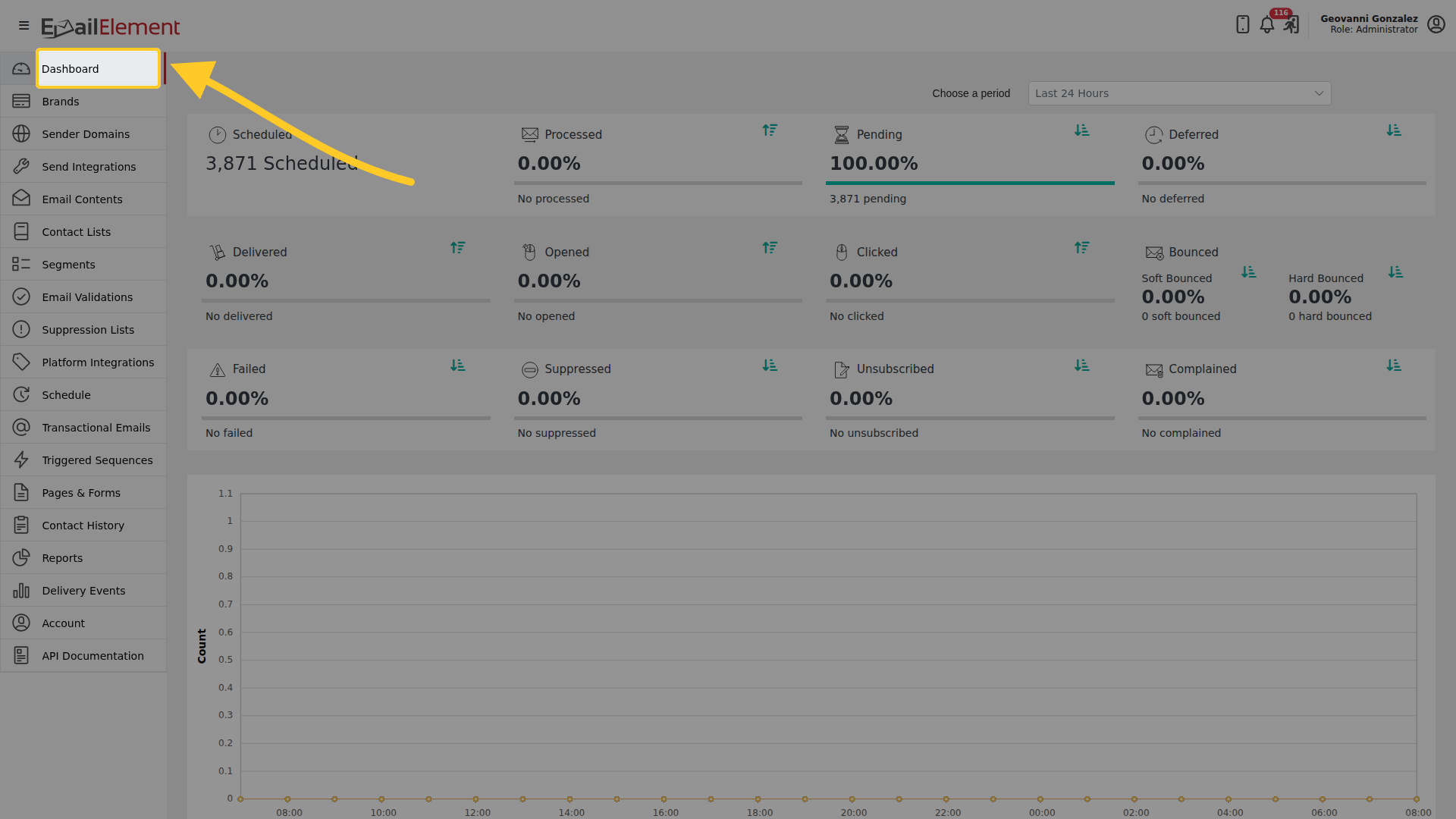
Step 1: Choose a period
Open the list at the top right. Every figure on the page follows this choice.
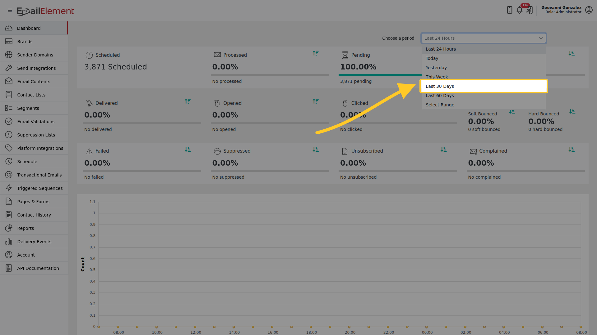
The choices are Last 24 Hours, Today, Yesterday, This Week, Last 30 Days, Last 60 Days, and Select Range for your own dates.
Step 2: Read the cards
With a period that has sends in it, the cards fill in.
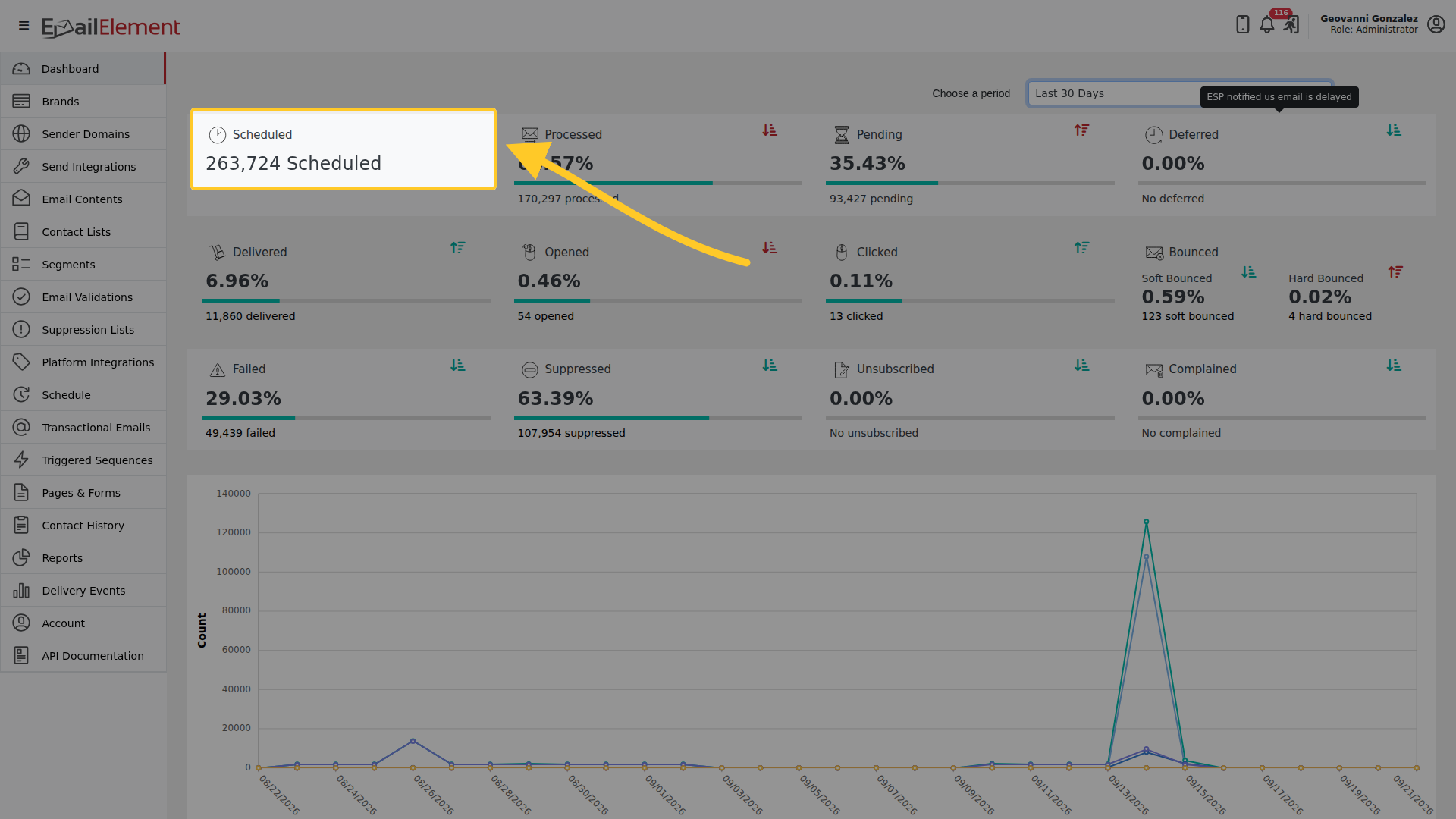
Each card shows a percentage with the count beneath it. They are grouped as:
| Row | Cards | What it tells you |
|---|---|---|
| First | Scheduled, Processed, Pending, Deferred | Where your sends are up to |
| Second | Delivered, Opened, Clicked, Bounced | How they landed. Bounced splits into soft and hard |
| Third | Failed, Suppressed, Unsubscribed, Complained | What went wrong or was stopped |
A card reading 0.00% with a count of 0 means nothing happened in that period. It is not a failure.
Step 3: Look at the individual sends
Below the chart is every scheduled email in the period.
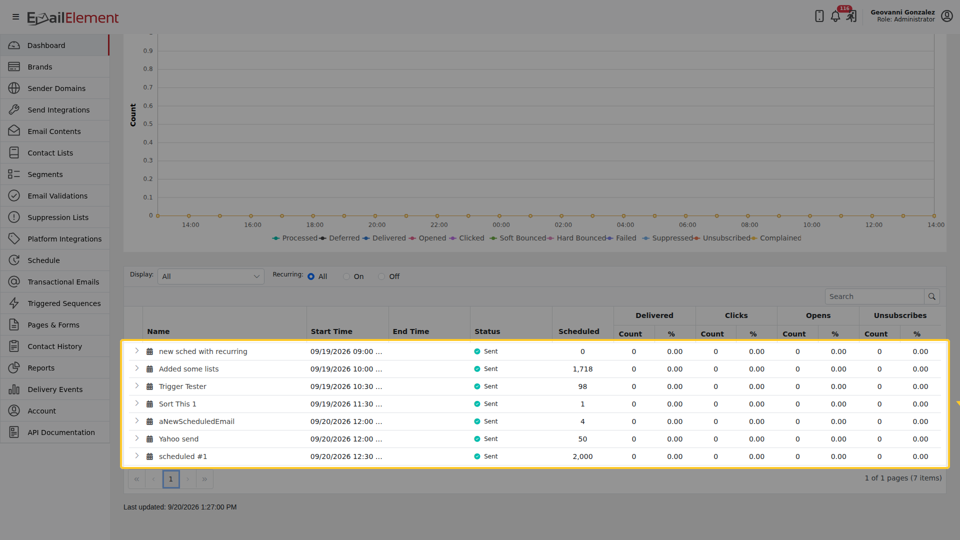
The columns are Name, Start Time, End Time, Status, Scheduled, then a count and a percentage for each event type. The arrow at the start of a row expands it. The footer pages through them and the page shows when it last refreshed.
Getting to the detail
Clicking a count on a card opens the report behind it with the same filter already applied, so you do not have to rebuild it.